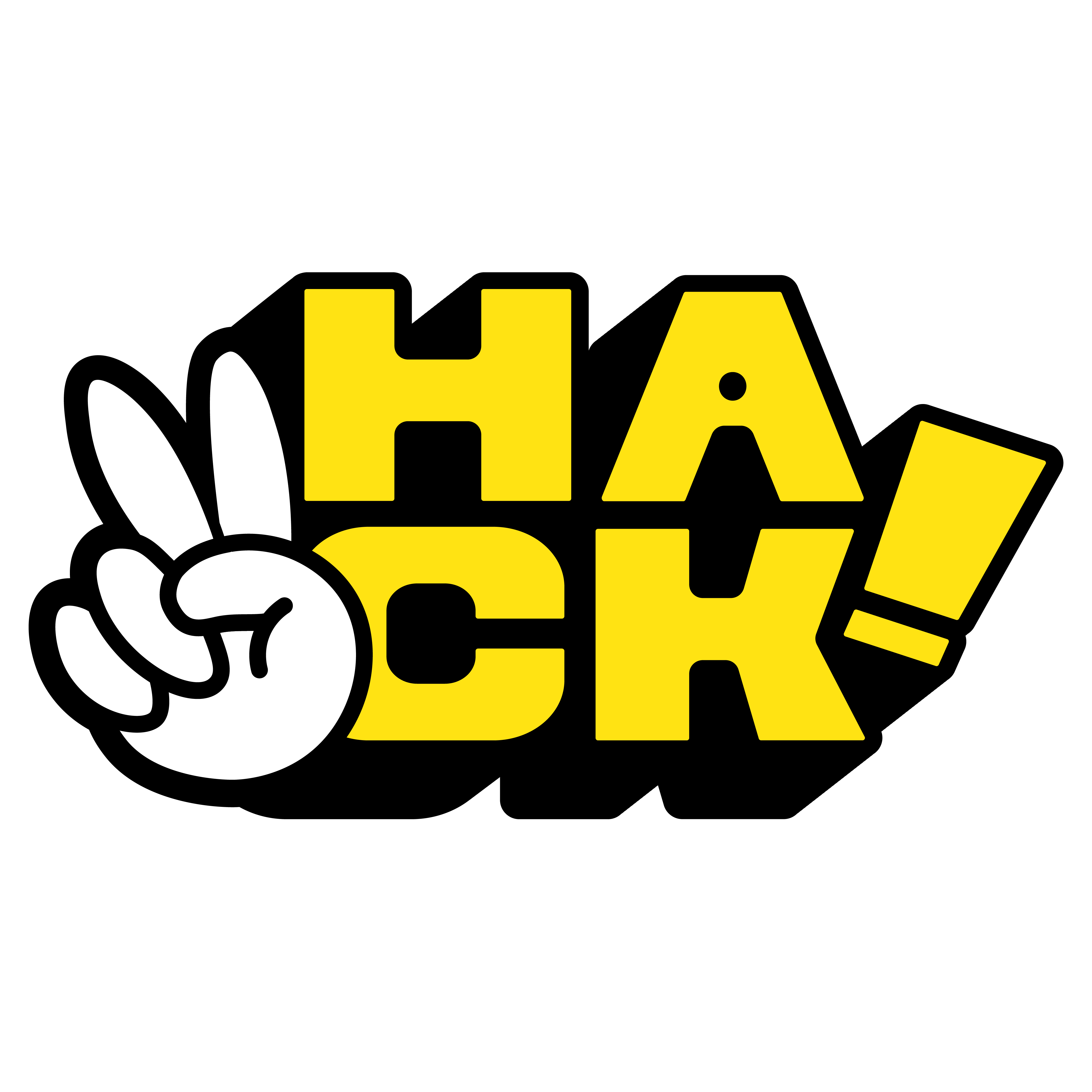
HACK!
Full rebranding for a DTF print shop. A new name, identity, and a client who became the brand.
Role Brand Designer & Content Strategist
Duration 8 months
Overview
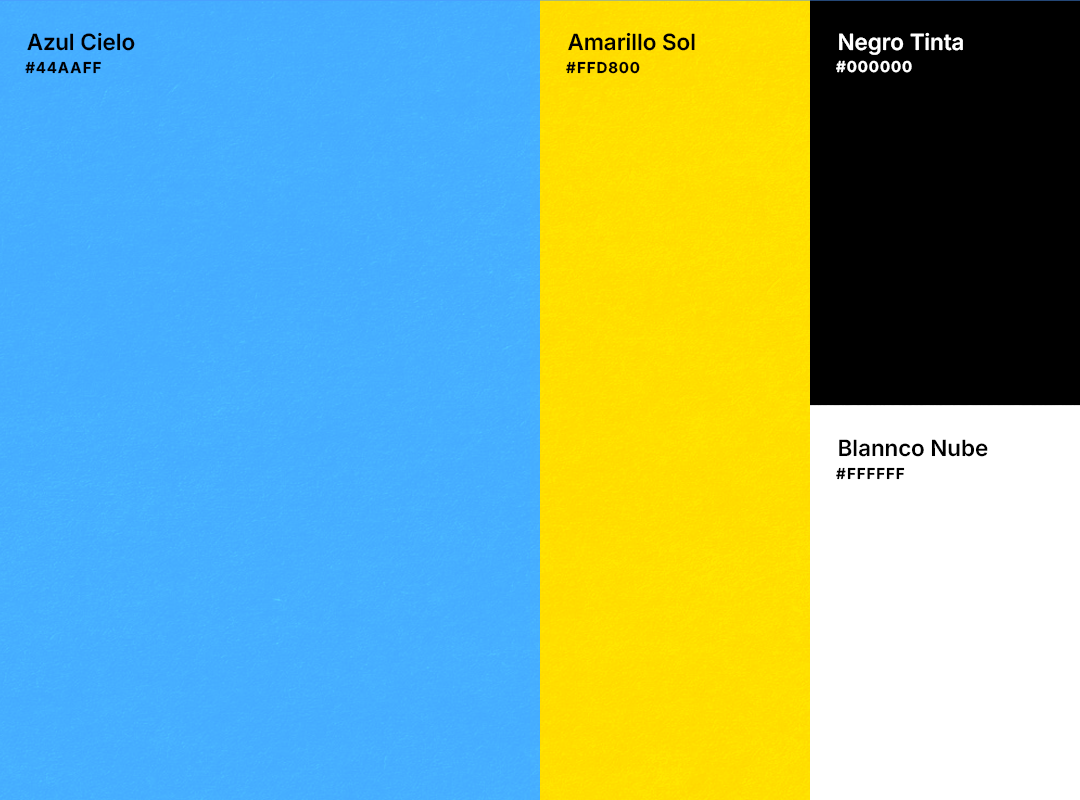
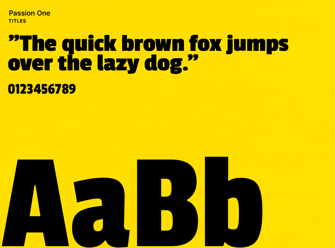
Nico had a print shop called "Hacker" with a broken identity that wasn't connecting. We did a full rebranding: new name (HACK!), logo, voice, iconography, and typography — followed by 3 months of daily content.
The Challenge
A brand that didn't reflect who Nico was. No clear direction, no visual consistency, and clients who didn't stick around.
The Solution
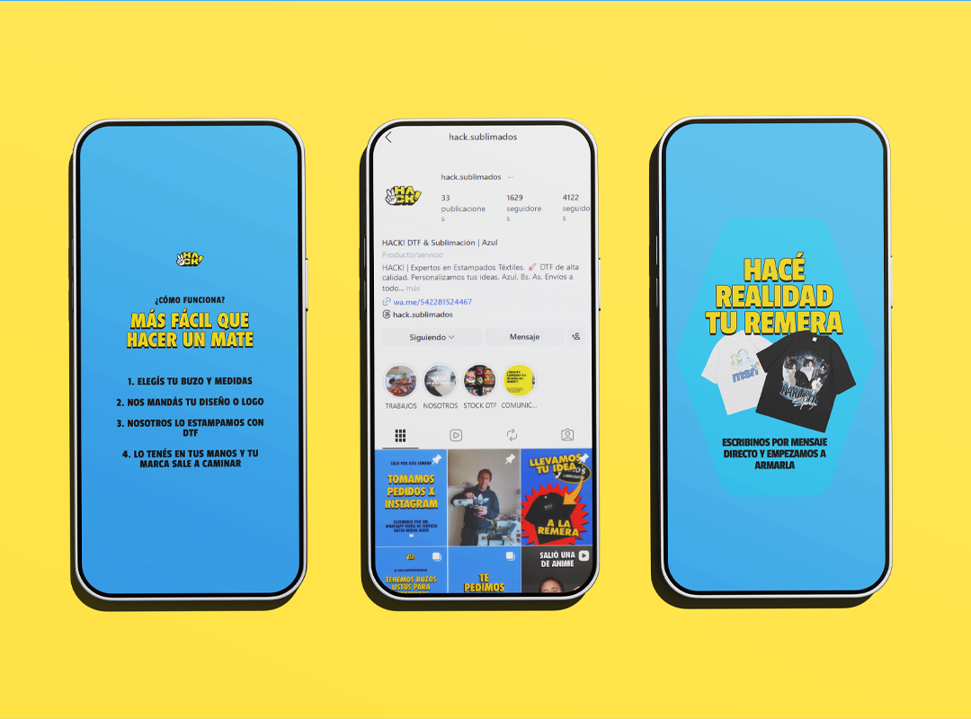
Moodboards, multiple iterations, and close collaboration until Nico saw himself in the brand. Then: photo sessions, video, ads, and daily content for 3 months straight.
Tools & Technologies
Photoshop · Illustrator · CapCut Pro · Figma · Meta Ads
Key Learnings
- Good design gives clients pride in their own brand.
- When your client becomes the face of the brand, you've nailed it.
- A long-term client isn't just a client, they're a partner.